
Improving cybersecurity learning through design
Phish Insight | Trend Micro
Impact|Improved Usability & Completion Rates
- Increased course completion rates for end users
- Reduced admin errors in course setup
Background|Upgrading a Neglected LMS
- 🖥️ Product type: Corporate cybersecurity LMS
- 🎨 Role: Product Designer teamed with Product Owner, Product Designer, Dev team
- 🏢 Market: Enterprises needing security awareness & phishing training
Our design team supported two separate development teams, which meant two product designers were assigned to cover both. I was part of the Training Team, responsible for features such as the LMS, user management, and related functionalities.
We followed a design thinking–driven workflow — starting with observation and research, and ending with validation through user testing. This approach helped ensure our solutions were grounded in real user needs and business goals.
We followed a design thinking–driven workflow — starting with observation and research, and ending with validation through user testing. This approach helped ensure our solutions were grounded in real user needs and business goals.
- Observation : Track screen recording, Interview...
- Define problem : Identify key pain points
- Deliver solution : UI mockups, prototypes
- Validation : Data tracking, Stakeholder interviews

Goal|Efficient Training for Learners & Admins
The aim was to make cyber security training more efficient:
- For learners: a focused, distraction-free experience that motivates completion.
- For admins: an intuitive setup process that saves time and reduces errors.
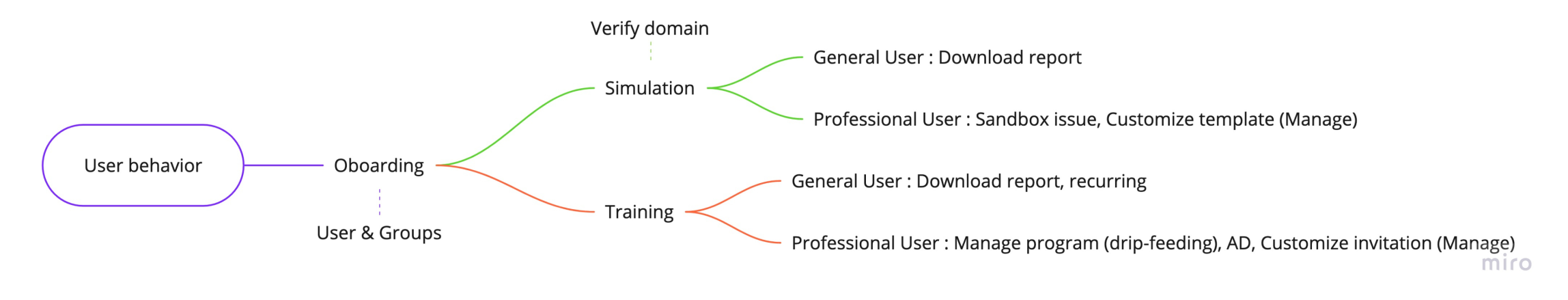
Pre-reseach|Redefining user persona of admin
Why We Started with Personas?
After the product had been on the market for some time, usage data revealed a critical insight — the users engaging with the training modules and those participating in phishing simulations were actually two distinct groups. This gap meant that our earlier design assumptions might not fully reflect the needs of each audience.
To make informed design decisions, we began the redesign process by creating precise, data-backed personas. This allowed us to tailor the experience for both groups from the very start, ensuring the platform would meet their specific goals and workflows.
Below is our analysis, results of persona and empathy map.


Design Highlights | User group management
User Group Management
Before sending campaign emails, users need to upload a recipient list (often CSVs exported from employee systems). However, each system provides different columns, leading to repeated feature requests for more customization.
Challenge
Users want the flexibility to define conditions and map columns easily, but the existing interface was too rigid and caused friction.
Users want the flexibility to define conditions and map columns easily, but the existing interface was too rigid and caused friction.
Design Actions
Start from our assumption, we create prototypes end with
Start from our assumption, we create prototypes end with
- Validate problem
We use hotjar widget to collect the satisfaction. This help us to validate the problem and request. and push us to develope.

- Lofi Prototype
Created a prototype based on common feature requests and assumptions. - User interview
Through the interviews we validate needs and the prototype. They enjoy our edit column feature which mapped our assumptions.

- UI mockups
Created a prototype based on common feature requests and assumptions. - Kickoff workshop
Since the project scope was quite large, we organized a workshop with all team members. The goal was to help them empathize with user pain points, which in turn gave everyone a clearer understanding of the overall story and direction for development.
Outcome
The interviews confirmed key usability gaps and guided us to refine the interface into a practical and user-centered solution that directly addresses real workflows.
The interviews confirmed key usability gaps and guided us to refine the interface into a practical and user-centered solution that directly addresses real workflows.

Notification Mail Enhancement
Originally, notification emails were only considered for simulation reminders. However, we discovered that admins also spent significant time creating training-related emails for employees (before, during, and after training).
We saw an opportunity to enhance this feature to better support both users (employees & admins) and improve efficiency.
We saw an opportunity to enhance this feature to better support both users (employees & admins) and improve efficiency.

Challenge
The original feature was weak and caused inefficiencies because:
The original feature was weak and caused inefficiencies because:
- Emails could not be created from blank or saved as templates.
- No preview was available before sending.
- Templates lacked localization.
Design Actions
- Customer Journey Mapping (CJM)
Mapped the end-to-end journey to identify key opportunities, which were later transformed into user stories.

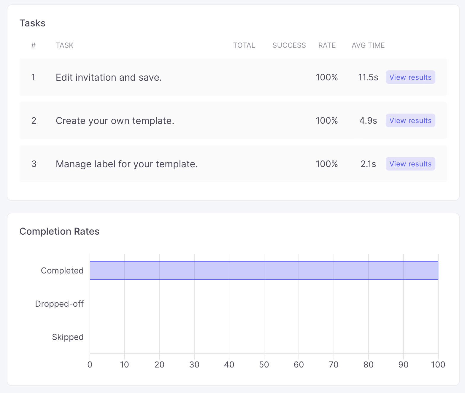
- Usability Tests
The goal was to evaluate whether users could successfully create notification templates, while also capturing their feelings and identifying any obstacles.
Outcome
Users were able to complete tasks smoothly, with improved clarity and efficiency. The most important things, we strengthened product competitiveness during customer evaluation.
Users were able to complete tasks smoothly, with improved clarity and efficiency. The most important things, we strengthened product competitiveness during customer evaluation.
Learnings|Monitoring and Iterate

We continuously monitored the features we delivered and iterated to improve them. Data analysis of real user behavior provided valuable insights, guiding design decisions and ensuring they were grounded in actual usage patterns. This process also highlighted the need to balance the often differing needs of admins and end users, requiring solutions that worked across both process and UI levels.
Through this project, I also gained deeper experience in product design and became more familiar with product thinking.
Through this project, I also gained deeper experience in product design and became more familiar with product thinking.

Wanna learn about this project?
Please contact me if you want to learn more for recruiting.
email me
Next design system