Creating a seamless fitness appointment experience across platforms
17FIT | 17FIT

Impact|Quantifiable & Scalable Outcomes
- Cross‑platform consistency: Established a single source of truth (SSOT) with Design Tokens + Storybook.
- Efficiency: Introduced a design system and componentization, reducing design delivery time by ~50%.
- Cultural growth: Advanced UX maturity to Stage 3 (NN/g framework), built a UX repository, and initiated internal sharing activities.
Due to the confidential policy, the content regarding features will not be very specific or detailed.
Background|B2B2C SaaS Cross‑Platform Challenge
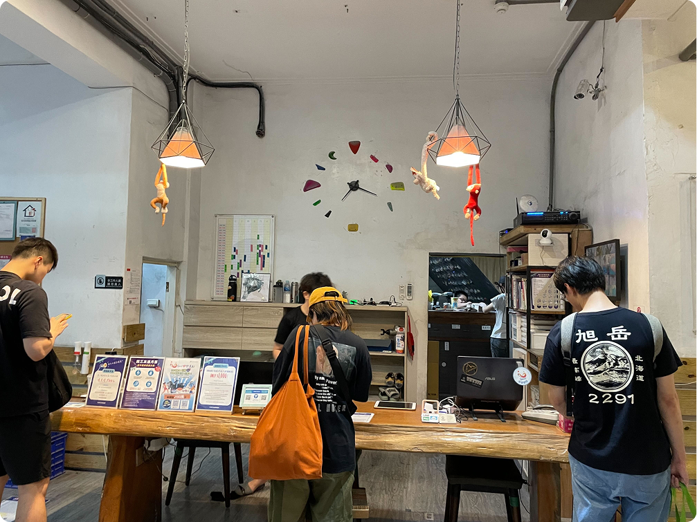
17FIT is a SaaS service offering checkout, management and analytics solutions for the sports and beauty industry, including gyms, bouldering gyms, yoga studios, and hair and nail studios. For consumers, we provide both a website and an app platform for booking and searching services.
- 🖥️ Product type: SaaS platform for gyms, climbing gyms, yoga studios, beauty salons. Provides B2B2C services: checkout, management, analytics; consumer side supports Web + App booking/search.
- 🎨 Role: Product Designer (collaborating with PMs, Front‑end, QA).
- 🏢 Market: Fitness, sports, and beauty service providers and their consumers.
Process (Design Thinking driven)
- Observation: Contextual inquiries, on‑site visits, surveys, App reviews, heatmaps, user session recordings.
- Define problem: Clarified core tasks and constraints for B2B vs. B2C, aligned on success metrics.
- Deliver solution: Systematic design (Tokens/Components), prototyping, interaction details (incl. micro‑interactions for waiting/error states).
- Validation: Usability testing, behavioral data review.

Preparation|Design system & Raising UX Maturity
Create Design System
17FIT runs on Web, iOS, Android, and Line App Browser. Each platform uses different frameworks (Tailwind, Mobiscroll) and platform guidelines (iOS/Android HIG). To ensure consistency and reduce communication overhead, I created Design Tokens and worked with front‑end developers to publish them in Storybook as a single source of truth. I also adopted Figma Variables to improve flexibility and maintenance efficiency.
.png)
.png)
Plus+: Lottie animation (For B2C)
Reduce drop-off rates during the purchasing process. Lottie animations are a great way to reduce user anxiety and frustration during waiting times and failed booking attempts. These animations were created and implemented directly using a Figma plugin, reducing both development costs and time.
Enhance UX maturity
Even though we have a design system, design thinking has not been fully adopted at 17FIT. A 'user-centered' approach is a really new concept for us. Nevertheless, as designers, we know that usability is a fundamental professional responsibility that can't be ignored. I'm using the NN/g Design Maturity Model to help the engineering team understand where we are now and where we need to grow.
- Applied NN/g UX maturity framework, gradually improving to Stage 3.
- Built a UX repository to centralize insights and knowledge.Introduced design system adoption to unify design and development
- Facilitated internal sharing sessions, promoting UX awareness across teams.
- These steps expanded influence beyond design execution, fostering a user‑centered mindset across stakeholders.

.png)
Design highlights
Explore | B2C
We redesigned the search experience. The original "class page" was inefficient, with an unintuitive interface that made it difficult for users to find the courses they wanted. We optimized the entire product experience, providing users with more relevant search results, while aligning with business goals and incorporating promotional information.
We also applied the design to our app. In addition to introducing a new exploration feature, we improved the app’s navigation functionality (confidential details).
.png)
.png)
Customer Analysis Dashboard | B2B
This feature stems from business needs to enhance product competitiveness. The Studio can use this dashboard to understand the activity level and value of individual customers for sales purposes. We assume these useful datas to present. Considerations include data visualization, readability, iteration, and component creation.

Sign up/ Log in | B2C
The request was to add a user account field to the login form. After clarifying the goal, we changed the single-page form to a step-by-step process to reduce the amount of data on one page, improve error-checking accuracy, and ensure correct data entry. The advantage of the new design is that we have made the login a standalone service, optimizing both the user experience and visual appeal.
The request was to add a user account field to the login form. After clarifying the goal, we changed the single-page form to a step-by-step process to reduce the amount of data on one page, improve error-checking accuracy, and ensure correct data entry. The advantage of the new design is that we have made the login a standalone service, optimizing both the user experience and visual appeal.
.png)

Homepage for Studio | B2B2C
Initially, the business information was not comprehensive. We extracted data related to system and venue information and researched the requirements to determine if they should be included in the feature. Currently, it displays activity information, venue introduction, social media, and more.
.png)
Learnings | Leverage
Delivering design efficiently across multiple platforms is a significant challenge. Design systems and design tokens have been instrumental in making this possible. However, instilling design thinking across the team remains a much larger challenge. Never underestimate your impact—sometimes, bottom-up changes can help the design team secure more resources and expand its influence. Even as a one-person team, it is possible to scale design practices and improve the overall design culture.

Wanna learn about this project?
Please contact me if you want to learn more for recruiting.
email me

Next design system
