Impact|Improving Accessibility and Expanding Usability
- Achieved WCAG 2.1 AA compliance:
• Full keyboard navigation support
• Accessibility score improved from 82 → 100 - Additionally promoted the AI Dashboard for better information access and engagement
Background|Inclusive Design for Education
- 🖥️ Product Type: Data visualization platform for the education sector & internal users
- 🎨 Role: Product Designer, collaborating with Product Owner and the Development team
- ⏱️ Duration: 4 months
- 🏢 Market: Education IT departments handling procurement and reporting
To promote inclusivity in education and comply with the EU Accessibility Act (EAA), our design team initiated a full-scale accessibility revamp across the product.
Our design processes included:
- Evaluate: Assess the product UI, define the modification scope, and identify the impact on the design system.
- Discuss: Align on objectives, acceptance criteria, and release schedule.
- Deliver: Create UI mockups and prototypes.
- Quality Check: Collaborate with QA and front-end developers to validate designs and prepare the VPAT(Voluntary Product Accessibility Template) documentation.
Goal|Enhance Accessibility
- Ensure UI and interaction meet WCAG 2.1 AA standards.
- Align visual and interaction design with the design system and brand direction.
- (Bonus) Improve information hierarchy and introduce the AI Dashboard to increase usability and engagement.
Evaluate & Discuss|Preparing the Ground
After aligning with the company OKRs, we began with two main challenges:
- The team struggled to imagine what the product would look like after applying the design system.
- There was limited awareness of the current accessibility issues.
To address this, I created a visual draft to help stakeholders envision the redesigned interface. We also prepared a VPAT (Voluntary Product Accessibility Template) to assess the current compliance level. In addition, I introduced the Lighthouse tool to help developers evaluate accessibility throughout development and collaborated with the team to define our validation criteria.
Design|Creating an Accessible and Unified Experience

"This was far more than just applying new colors or replacing components."
We needed to reference other product layouts to ensure visual and structural consistency, while also considering accessibility in real scenarios—such as keyboard navigation, focus order, and voice-over reading behavior.
Highlights|Accessibility in Action
Interface Colors
All interface and chart elements were adjusted to maintain a contrast ratio above 4.5:1.Future updates will further adapt the color palette for color-blind accessibility.
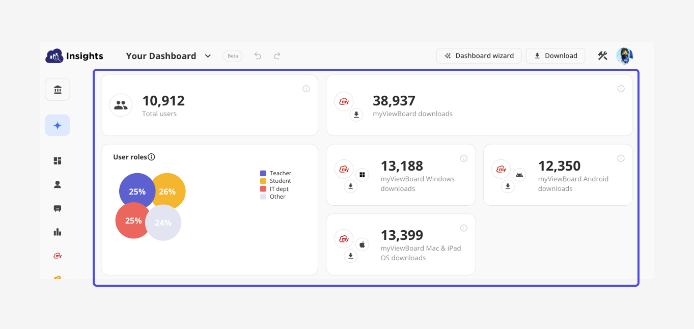
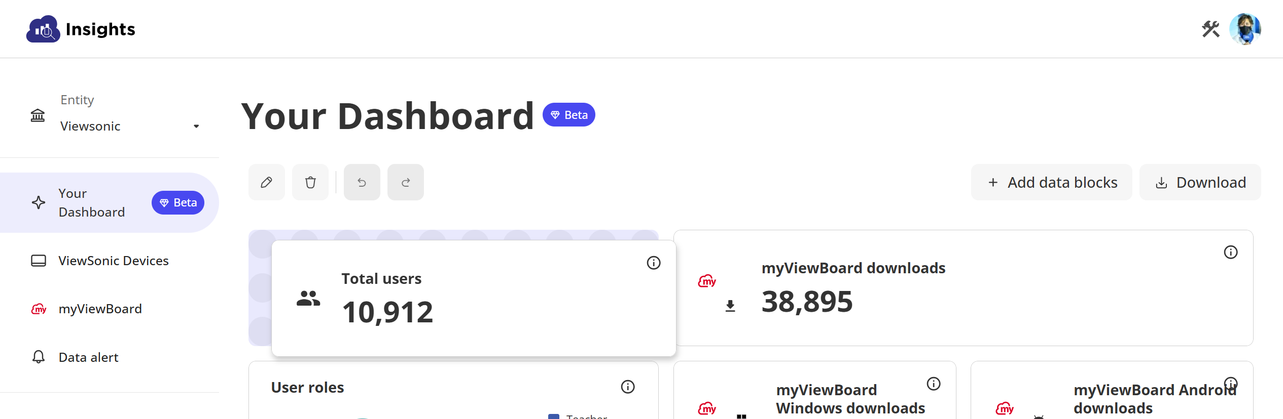
AI Dashboard
Following WCAG principles, all dashboard operations—including delete, move, resize, and drag-and-drop—must be keyboard-accessible. We designed Enter and Shift-based keyboard controls to replicate these interactions while maintaining parity with mouse functionality.
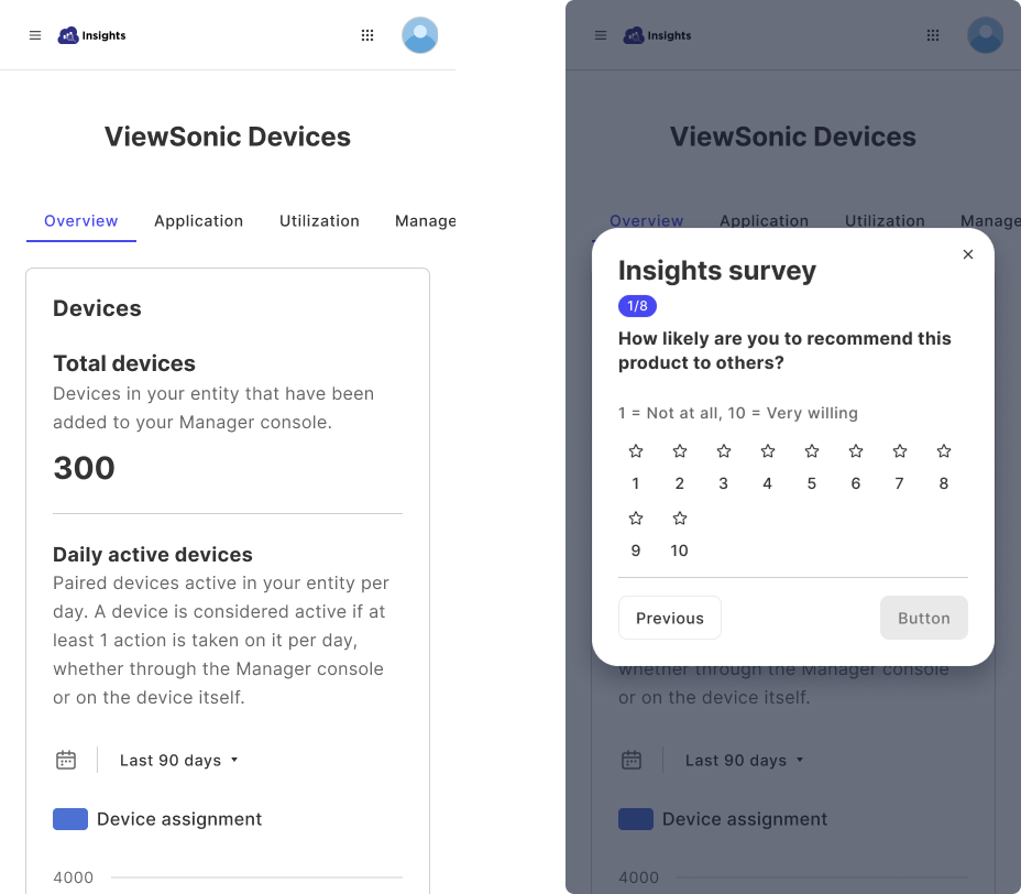
Responsive Website
Previously, not all features were responsive. We simplified layouts to ensure a consistent and readable experience across devices, making accessibility part of visual simplicity.
UI
Learnings|Empathy Through Accessibility
.png)
During this period, we received accessibility training and earned A11Y certification.Building accessibility requires empathy—understanding how users navigate through hearing and keyboard interactions.Although it was a large-scale effort, the result was deeply rewarding: more people can now access and use the product with confidence.